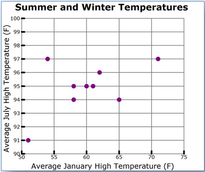
A scatterplot is a graph that is used to compare two different data sets.
|
City |
Average January |
Average July |
|
College Station |
61 |
95 |
|
Austin |
62 |
96 |
|
Longview |
58 |
94 |
|
Wichita Falls |
54 |
97 |
|
Victoria |
65 |
94 |
|
McAllen |
71 |
97 |
|
San Angelo |
60 |
95 |
|
El Paso |
58 |
95 |
|
Amarillo |
51 |
91 |
A scatterplot is created by rewriting the table values as a set of ordered pairs, and plotting one variable along the x-axis and one variable along the y-axis.

Scatterplots are typically used to determine if there is a relationship between the two variables. Researchers, engineers, and statisticians frequently use scatterplots to look for these relationships since they are a visual representation. In a scatterplot, you may spot trends that you don't easily see in a data table.
In this lesson, you will investigate ways to distinguish between different types of relationships that can be presented in a scatterplot. If the relationship is a linear one, then you will also use a trend line to make predictions.