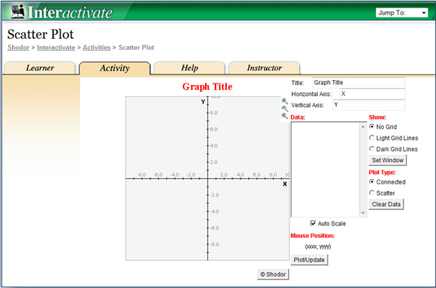
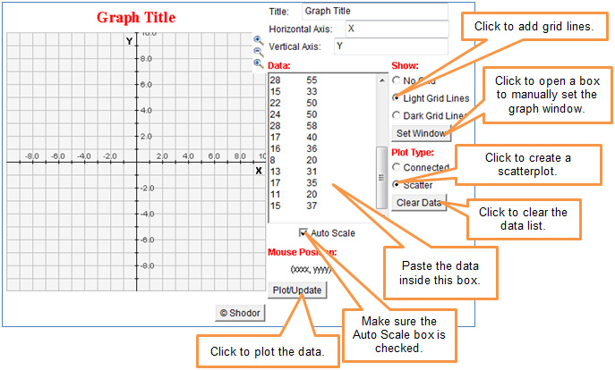
Use The ScatterPlot grapher by clicking the image below. The grapher will open in a new tab or window.
In this section, you will compare linear and non-linear associations in order to distinguish between the two types of association in bivariate data. An association between two data sets occurs when there is a relationship between the values in one data set and the values in the other data set.
Use The ScatterPlot grapher by clicking the image below. The grapher will open in a new tab or window.

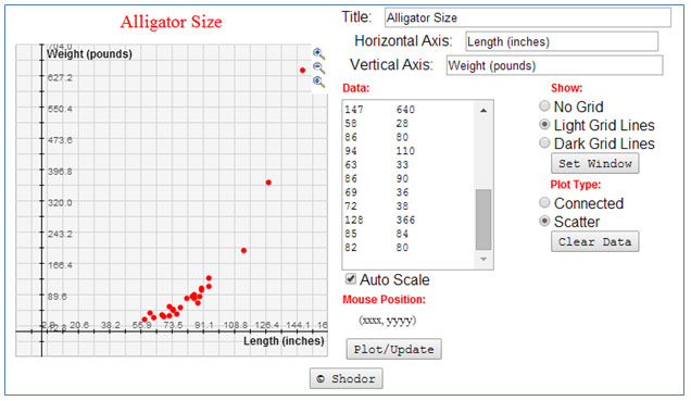
The table below contains data relating the weight of an alligator in pounds to the length of an alligator in inches.
|
Alligator Size
|
|
|
Weight of Alligator
(pounds) |
Length of Alligator
(inches) |
|
86
|
83
|
|
88
|
70
|
|
72
|
61
|
|
74
|
54
|
|
61
|
44
|
|
90
|
106
|
|
89
|
84
|
|
68
|
39
|
|
76
|
42
|
|
114
|
197
|
|
90
|
102
|
|
78
|
57
|
|
94
|
130
|
|
74
|
51
|
|
147
|
640
|
|
58
|
28
|
|
86
|
80
|
|
94
|
110
|
|
63
|
33
|
|
86
|
90
|
|
69
|
36
|
|
72
|
38
|
|
128
|
366
|
|
85
|
84
|
|
82
|
80
|
Copy the numeric portion of the data only (i.e., do not copy the row headers). Paste the data into the Data box of the grapher.
Interactive popup. Assistance may be required.
Interactive popup. Assistance may be required.
No. The points appear to curve upward, especially when the length of the alligator is more than about 100 inches.
Interactive popup. Assistance may be required.
No. As the length of the alligator increases, the weight of the alligator also increases, but not at a reasonably constant rate of change. Once the alligator is about 90 inches in length, there is a larger increase in weight for each inch of increase in length.
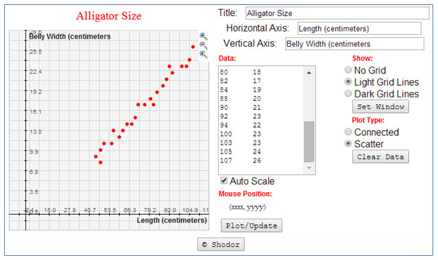
Use The Scatter Plot grapher by clicking the image below. The grapher will open in a new tab or window.
|
Alligator Size
|
|
|
Length of Alligator
(centimeters) |
Belly Width of Alligator
(centimeters) |
|
45
|
9
|
|
48
|
10
|
|
48
|
8
|
|
50
|
11
|
|
55
|
11
|
|
56
|
13
|
|
60
|
12
|
|
62
|
13
|
|
65
|
14
|
|
68
|
14
|
|
70
|
15
|
|
72
|
17
|
|
76
|
17
|
|
80
|
18
|
|
82
|
17
|
|
84
|
19
|
|
88
|
20
|
|
90
|
21
|
|
92
|
23
|
|
94
|
22
|
|
100
|
23
|
|
103
|
23
|
|
105
|
24
|
|
107
|
26
|
Copy the numeric portion of the data only (i.e., do not copy the row headers). Paste the data into the Data box of the grapher.
Interactive popup. Assistance may be required.
Interactive popup. Assistance may be required.
Yes. The points representing the data appear to follow a straight line.
Interactive popup. Assistance may be required.
Yes. The belly width seems to increase at a reasonably constant rate of change as compared to the alligator length. For each increase of 1 centimeter in length, there seems to be the same increase in belly width.
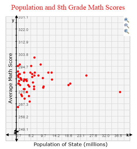
Data sets could have a linear association or a non-linear association. But not all data sets have an association. For example, consider the graph below that shows the relationship between the population according to the 2010 U.S. Census of each state and that state’s average 8th grade math score on a national mathematics test in 2013.
Interactive popup. Assistance may be required.
There appears to be no association between a state’s population and its average 8th grade math score. The data values in the scatterplot do not appear to follow a linear trend or a curved, non-linear trend.
When you look at a scatterplot of data, how can you tell the difference between the appearance of the scatterplot with a linear association or a scatterplot with a non-linear association?
How do the rates of change for linear associations and non-linear associations compare?
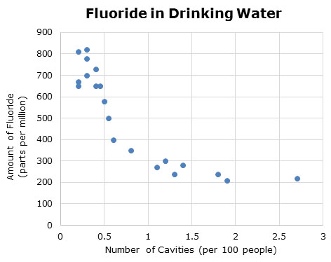
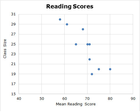
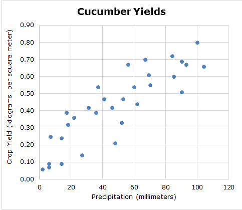
For each of the data sets below, decide whether the scatterplot best represents a linear association or non-linear association.