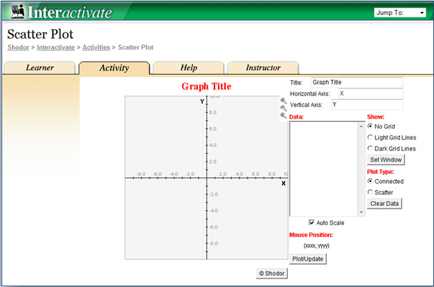
Use The ScatterPlot grapher by clicking the image below.
 In the last section, you used scatterplots to distinguish between linear associations and non-linear associations. In this section, you will use scatterplots to distinguish between positive linear associations and negative linear associations. In a linear association, data will appear to be clustered around a trend line. Data are said to be clustered when the data values seem to be gathered around a particular value.
In this section, you will practice creating a scatterplot, and then use that scatterplot to analyze a relationship that exhibits a positive trend.
Use The ScatterPlot grapher by clicking the image below.

| Semi-Monthly Data Collection | ||
|
Week
|
Number of Jars of Peach Preserves Sold in Fredericksburg, Texas
|
Songs Downloaded in New York City (thousands)
|
|
January 1
|
8
|
16
|
|
January 15
|
15
|
35
|
|
February 1
|
17
|
32
|
|
February 15
|
11
|
28
|
|
March 1
|
19
|
40
|
|
March 15
|
25
|
55
|
|
April 1
|
30
|
60
|
|
April 15
|
31
|
70
|
|
May 1
|
33
|
75
|
|
May 15
|
37
|
80
|
|
June 1
|
35
|
72
|
|
June 15
|
32
|
76
|
|
July 1
|
28
|
55
|
|
July 15
|
15
|
33
|
|
August 1
|
22
|
50
|
|
August 15
|
24
|
50
|
|
September 1
|
28
|
58
|
|
September 15
|
17
|
40
|
|
October 1
|
16
|
36
|
|
October 15
|
8
|
20
|
|
November 1
|
13
|
31
|
|
November 15
|
17
|
35
|
|
December 1
|
11
|
20
|
|
December 15
|
15
|
37
|
| Number of Jars of Peach Preserves Sold in Fredericksburg, Texas | Songs Downloaded in New York City (thousands) |
|
8
|
16
|
|
15
|
35
|
|
17
|
32
|
|
11
|
28
|
|
19
|
40
|
|
25
|
55
|
|
30
|
60
|
|
31
|
70 |
|
33
|
75
|
|
37
|
80
|
|
35
|
72
|
|
32
|
76
|
|
28
|
55
|
|
15
|
33
|
|
22
|
50
|
|
24
|
50
|
|
28
|
58
|
|
17
|
40
|
|
16
|
36
|
|
8
|
20
|
|
13
|
31
|
|
17
|
35
|
|
11
|
20
|
|
15
|
37
|
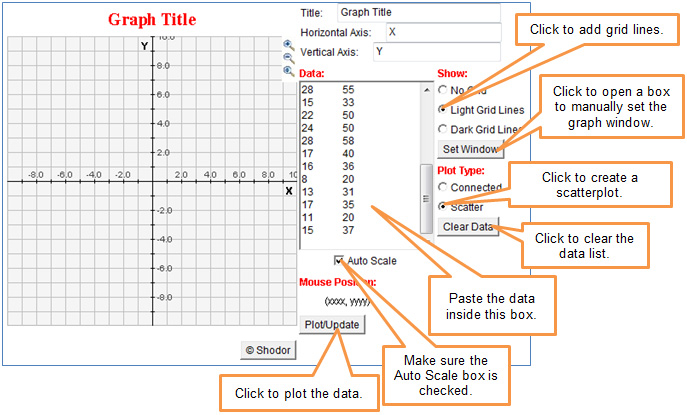
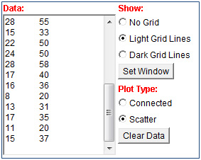
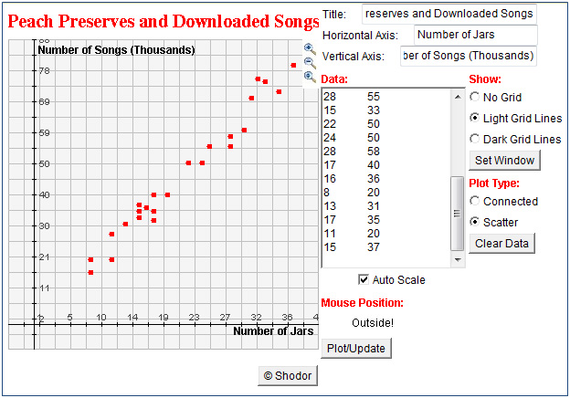
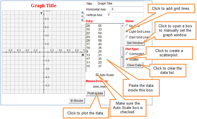
From the table in the popup, copy the data from the Number of Jars of Peach Preserves column and Songs Downloaded column. Paste the data into the Data box of the grapher.
 Interactive popup. Assistance may be required.
  Interactive popup. Assistance may be required.
As the number of jars of peach preserves sold in Fredericksburg, Texas, increases, the number of songs downloaded in New York City also increases. Interactive popup. Assistance may be required.
If a greater number of jars of peach preserves is sold in Fredericksburg, Texas, then there should be a greater number of songs downloaded in New York City.
Interactive popup. Assistance may be required.
As the number of jars of peach preserves sold in Fredericksburg, Texas, increases, the number of songs downloaded in New York City also increases. Interactive popup. Assistance may be required.
If a greater number of jars of peach preserves is sold in Fredericksburg, Texas, then there should be a greater number of songs downloaded in New York City. Interactive popup. Assistance may be required.
The trend line would have a positive slope.
Interactive popup. Assistance may be required.
Possible answer: The relationship has a positive association because the data values are clustered along a trend line with a positive slope.
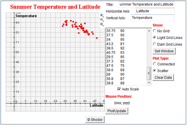
Use The ScatterPlot grapher by clicking the image below.
|
City |
Latitude (°N) |
Average July High Temperature (°F) |
|
Atlanta, Georgia |
33.75 |
89 |
|
Austin, Texas |
30.25 |
96 |
|
Baltimore, Maryland |
39.3 |
87 |
|
Birmingham, Alabama |
33.5 |
91 |
|
Boston, Massachusetts |
42.6 |
81 |
|
Buffalo, New York |
43 |
80 |
|
Charlotte, North Carolina |
35.25 |
89 |
|
Chicago, Illinois |
41.8 |
84 |
|
Cincinnati, Ohio |
39 |
87 |
|
Cleveland, Ohio |
41.3 |
83 |
|
Columbus, Ohio |
40 |
85 |
|
Dallas, Texas |
32.75 |
96 |
|
Denver, Colorado |
39.75 |
88 |
|
Detroit, Michigan |
42.3 |
83 |
|
Hartford, Connecticut |
41.8 |
85 |
|
Houston, Texas |
30 |
94 |
|
Indianapolis, Indiana |
39.75 |
85 |
|
Jacksonville, Florida |
30.2 |
92 |
|
Kansas City, Missouri |
39 |
90 |
|
Louisville, Kentucky |
38.25 |
89 |
|
Memphis, Tennessee |
35.1 |
92 |
|
Milwaukee, Wisconsin |
43 |
80 |
|
Minneapolis, Minnesota |
45 |
83 |
|
Nashville, Tennessee |
36.2 |
89 |
|
New Orleans, Louisiana |
30 |
91 |
|
New York, New York |
40.8 |
84 |
|
Oklahoma City, Oklahoma |
35.5 |
94 |
|
Orlando, Florida |
28.5 |
92 |
|
Philadelphia, Pennsylvania |
40 |
87 |
|
Pittsburgh, Pennsylvania |
40.5 |
83 |
|
Portland, Oregon |
45.5 |
81 |
|
Providence, Rhode Island |
41.8 |
83 |
|
Raleigh, North Carolina |
35.75 |
90 |
|
Richmond, Virginia |
37.5 |
90 |
|
Riverside, California |
34 |
95 |
|
Rochester, New York |
43.2 |
81 |
|
Sacramento, California |
38.6 |
92 |
|
Salt Lake City, Utah |
40.75 |
93 |
|
San Antonio, Texas |
29.5 |
95 |
|
San Jose, California |
37.3 |
82 |
|
Seattle, Washington |
47.6 |
76 |
|
St. Louis, Missouri |
38.6 |
89 |
|
Tampa, Florida |
28 |
90 |
|
Virginia Beach, Virginia |
36.8 |
87 |
|
Washington, DC |
38.8 |
88 |
From the table in the popup, copy the data from the Latitude (°N) column and Average July High Temperature (°F) column. Paste the data into the Data box of the grapher.
|
Latitude (°N) |
Average July High Temperature (°F) |
|
33.75 |
89 |
|
30.25 |
96 |
|
39.3 |
87 |
|
33.5 |
91 |
|
42.6 |
81 |
|
43 |
80 |
|
35.25 |
89 |
|
41.8 |
84 |
|
39 |
87 |
|
41.3 |
83 |
|
40 |
85 |
|
32.75 |
96 |
|
39.75 |
88 |
|
42.3 |
83 |
|
41.8 |
85 |
|
30 |
94 |
|
39.75 |
85 |
|
30.2 |
92 |
|
39 |
90 |
|
38.25 |
89 |
|
35.1 |
92 |
|
43 |
80 |
|
45 |
83 |
|
36.2 |
89 |
|
30 |
91 |
|
40.8 |
84 |
|
35.5 |
94 |
|
28.5 |
92 |
|
40 |
87 |
|
40.5 |
83 |
|
45.5 |
81 |
|
41.8 |
83 |
|
35.75 |
90 |
|
37.5 |
90 |
|
34 |
95 |
|
43.2 |
81 |
|
38.6 |
92 |
|
40.75 |
93 |
|
29.5 |
95 |
|
37.3 |
82 |
|
47.6 |
76 |
|
38.6 |
89 |
|
28 |
90 |
|
36.8 |
87 |
|
38.8 |
88 |
 Interactive popup. Assistance may be required.
  Interactive popup. Assistance may be required.
As the latitude of the city increases, the city’s average July high temperature decreases. Interactive popup. Assistance may be required.
If a randomly chosen city has greater latitude, then that city's average July high temperature will be lower.
Interactive popup. Assistance may be required.
As the latitude of the city increases, the city’s average July high temperature decreases. Interactive popup. Assistance may be required.
If a randomly chosen city has greater latitude, then that city's average July high temperature will be lower. Interactive popup. Assistance may be required.
The trend line would have a negative slope.
Interactive popup. Assistance may be required.
Possible answer: The relationship has a negative association because the data values are clustered along a trend line with a negative slope.
How can you tell from a scatterplot whether a set of data shows a positive linear association or a negative linear association? (Hint: think about the slope of the line approximating the data.)
How could a trend line help you to determine if the slope is positive or negative?
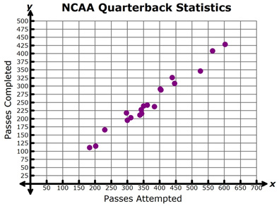
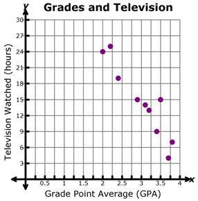
Determine whether each of the graphs below shows a positive linear association or a negative linear association.