

In this section, you will practice creating a scatterplot, and then using that scatterplot to analyze a relationship that exhibits a positive trend.
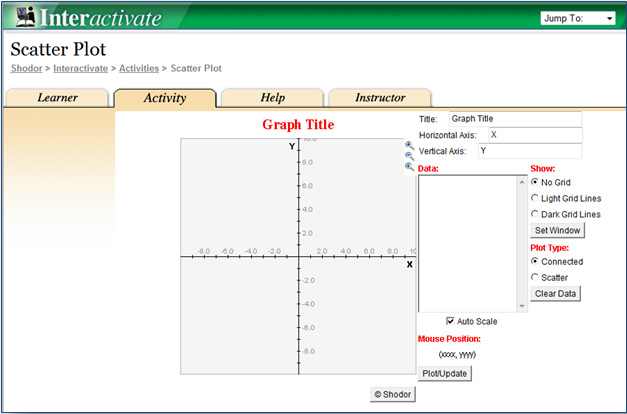
Use the ScatterPlot grapher by clicking the image below. The grapher will open in a new tab or window.

| Semi-Monthly Data Collection | ||
Week |
Number of Jars of Peach Preserves Sold in Fredericksburg, Texas |
Songs Downloaded in New York City (thousands) |
January 1 |
8 |
16 |
January 15 |
15 |
35 |
February 1 |
17 |
32 |
February 15 |
11 |
28 |
March 1 |
19 |
40 |
March 15 |
25 |
55 |
April 1 |
30 |
60 |
April 15 |
31 |
70 |
May 1 |
33 |
75 |
May 15 |
37 |
80 |
June 1 |
35 |
72 |
June 15 |
32 |
76 |
July 1 |
28 |
55 |
July 15 |
15 |
33 |
August 1 |
22 |
50 |
August 15
|
24 |
50 |
September 1 |
28 |
58 |
September 15 |
17 |
40 |
October 1 |
16 |
36 |
October 15 |
8 |
20 |
November 1 |
13 |
31 |
November 15 |
17 |
35 |
December 1 |
11 |
20 |
December 15 |
15 |
37 |
| Number of Jars of Peach Preserves Sold in Fredericksburg, Texas | Songs Downloaded in New York City (thousands) |
8 |
16 |
15 |
35 |
17 |
32 |
11 |
28 |
19 |
40 |
25 |
55 |
30 |
60 |
31 |
70 |
33 |
75
|
37 |
80 |
35 |
72 |
32 |
76 |
28 |
55 |
15 |
33 |
22 |
50 |
24 |
50 |
28 |
58 |
17 |
40 |
16 |
36 |
8 |
20 |
13 |
31 |
17 |
35 |
11 |
20 |
15 |
37 |
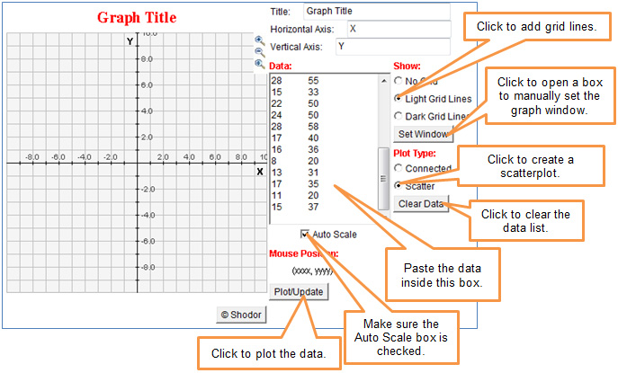
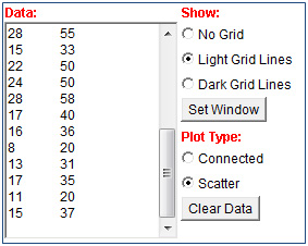
From the table in the popup, copy the data from the Number of Jars of Peach Preserves column and Songs Downloaded column. Paste the data into the Data box of the grapher.
 Interactive popup. Assistance may be required.
 Interactive popup. Assistance may be required.
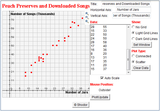
As the number of jars of peach preserves sold in Fredericksburg, Texas, increases, the number of songs downloaded in New York City also increases.
Interactive popup. Assistance may be required.
If a greater number of jars of peach preserves is sold in Fredericksburg, Texas, then there should be a greater number of songs downloaded in New York City.
Interactive popup. Assistance may be required.
As the number of jars of peach preserves sold in Fredericksburg, Texas, increases, the number of songs downloaded in New York City also increases.
Interactive popup. Assistance may be required.
If a greater number of jars of peach preserves is sold in Fredericksburg, Texas, then there should be a greater number of songs downloaded in New York City.