

In this section, you will practice creating a scatterplot, and then using that scatterplot to analyze a relationship that exhibits a negative trend.
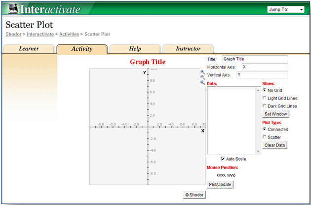
Use the ScatterPlot grapher by clicking the image below. The grapher will open in a new tab or window.

City |
Latitude (°N) |
Average July High Temperature (°F) |
Atlanta, Georgia |
33.75 |
89 |
Austin, Texas |
30.25 |
96 |
Baltimore, Maryland |
39.3 |
87 |
Birmingham, Alabama |
33.5 |
91 |
Boston, Massachusetts |
42.6 |
81 |
Buffalo, New York |
43 |
80 |
Charlotte, North Carolina |
35.25 |
89 |
Chicago, Illinois |
41.8 |
84 |
Cincinnati, Ohio |
39 |
87 |
Cleveland, Ohio |
41.3 |
83 |
Columbus, Ohio |
40 |
85 |
Dallas, Texas |
32.75 |
96 |
Denver, Colorado |
39.75 |
88 |
Detroit, Michigan |
42.3 |
83 |
Hartford, Connecticut |
41.8 |
85 |
Houston, Texas |
30 |
94 |
Indianapolis, Indiana |
39.75 |
85 |
Jacksonville, Florida |
30.2 |
92 |
Kansas City, Missouri |
39 |
90 |
Louisville, Kentucky |
38.25 |
89 |
Memphis, Tennessee |
35.1 |
92 |
Milwaukee, Wisconsin |
43 |
80 |
Minneapolis, Minnesota |
45 |
83 |
Nashville, Tennessee |
36.2 |
89 |
New Orleans, Louisiana |
30 |
91 |
New York, New York |
40.8 |
84 |
Oklahoma City, Oklahoma |
35.5 |
94 |
Orlando, Florida |
28.5 |
92 |
Philadelphia, Pennsylvania |
40 |
87 |
Pittsburgh, Pennsylvania |
40.5 |
83 |
Portland, Oregon |
45.5 |
81 |
Providence, Rhode Island |
41.8 |
83 |
Raleigh, North Carolina |
35.75 |
90 |
Richmond, Virginia |
37.5 |
90 |
Riverside, California |
34 |
95 |
Rochester, New York |
43.2 |
81 |
Sacramento, California |
38.6 |
92 |
Salt Lake City, Utah |
40.75 |
93 |
San Antonio, Texas |
29.5 |
95 |
San Jose, California |
37.3 |
82 |
Seattle, Washington |
47.6 |
76 |
St. Louis, Missouri |
38.6 |
89 |
Tampa, Florida |
28 |
90 |
Virginia Beach, Virginia |
36.8 |
87 |
Washington, DC |
38.8 |
88 |
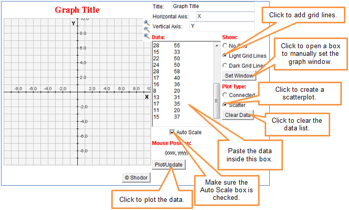
From the table in the popup, copy the data from the Latitude (°N) column and Average July High Temperature (°F) column. Paste the data into the Data box of the grapher.
Latitude (°N) |
Average July High Temperature (°F) |
33.75 |
89 |
30.25 |
96 |
39.3 |
87 |
33.5 |
91 |
42.6 |
81 |
43 |
80 |
35.25 |
89 |
41.8 |
84 |
39 |
87 |
41.3 |
83 |
40 |
85 |
32.75 |
96 |
39.75 |
88 |
42.3 |
83 |
41.8 |
85 |
30 |
94 |
39.75 |
85 |
30.2 |
92 |
39 |
90 |
38.25 |
89 |
35.1 |
92 |
43 |
80 |
45 |
83 |
36.2 |
89 |
30 |
91 |
40.8 |
84 |
35.5 |
94 |
28.5 |
92 |
40 |
87 |
40.5 |
83 |
45.5 |
81 |
41.8 |
83 |
35.75 |
90 |
37.5 |
90 |
34 |
95 |
43.2 |
81 |
38.6 |
92 |
40.75 |
93 |
29.5 |
95 |
37.3 |
82 |
47.6 |
76 |
38.6 |
89 |
28 |
90 |
36.8 |
87 |
38.8 |
88 |
 Interactive popup. Assistance may be required.
 Interactive popup. Assistance may be required.
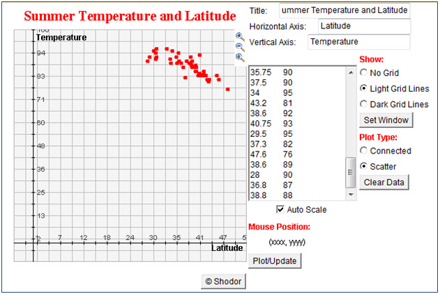
As the latitude of the city increases, the city’s average July high temperature decreases.
Interactive popup. Assistance may be required.
If a randomly chosen city has greater latitude, then that city's average July high temperature will be lower.
Interactive popup. Assistance may be required.
As the latitude of the city increases, the city’s average July high temperature decreases.
Interactive popup. Assistance may be required.
If a randomly chosen city has greater latitude, then that city's average July high temperature will be lower.