Now that you’ve investigated important aspects of three types of relationships that are easily seen in a scatterplot, let’s practice analyzing a few scatterplots.
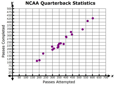
Use the graph to answer questions 1-3.
The scatterplot shows the number of passes attempted and the number of passes successfully completed for each of the top 20 NCAA Division I quarterbacks during the 2011 football season.

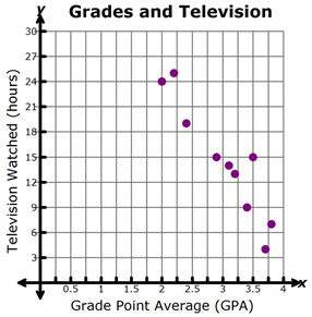
Use the graph to answer questions 4-6.
The scatterplot shows the grade point average (GPA) and number of hours of television watched per week for a group of students that Cassandra interviewed.