

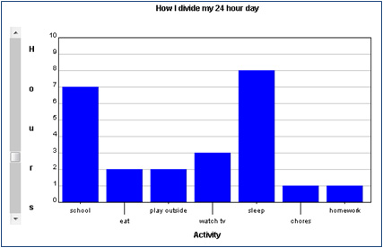
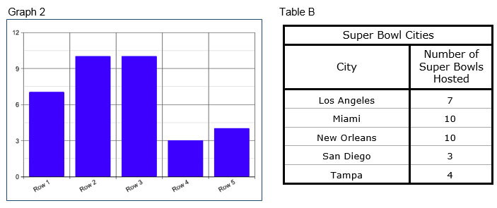
Different types of data sets show different relationships among the data. Sometimes, you have data that appear in categories. You can use a bar graph or a Venn diagram to compare the categories of data.
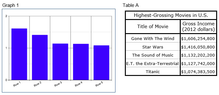
The table below shows the ten albums with the highest sales totals, in millions of albums sold, in the United States, as of 2012.
Ten Best-Selling Albums in the United States |
|||
Artist |
Album Title |
Year |
Sales |
Michael Jackson |
Thriller |
1982 |
29 |
Eagles |
Their Greatest Hits (1971-1975) |
1976 |
29 |
Led Zeppelin |
Led Zeppelin IV |
1971 |
23 |
AC/DC |
Back in Black |
1980 |
22 |
Fleetwood Mac |
Rumours |
1977 |
19 |
Guns N’ Roses |
Appetite for Destruction |
1987 |
18 |
Boston |
Boston |
1976 |
17 |
Eagles |
Hotel California |
1976 |
16 |
Elton John |
Greatest Hits |
1974 |
16 |
Alanis Morrisette |
Jagged Little Pill |
1995 |
15 |
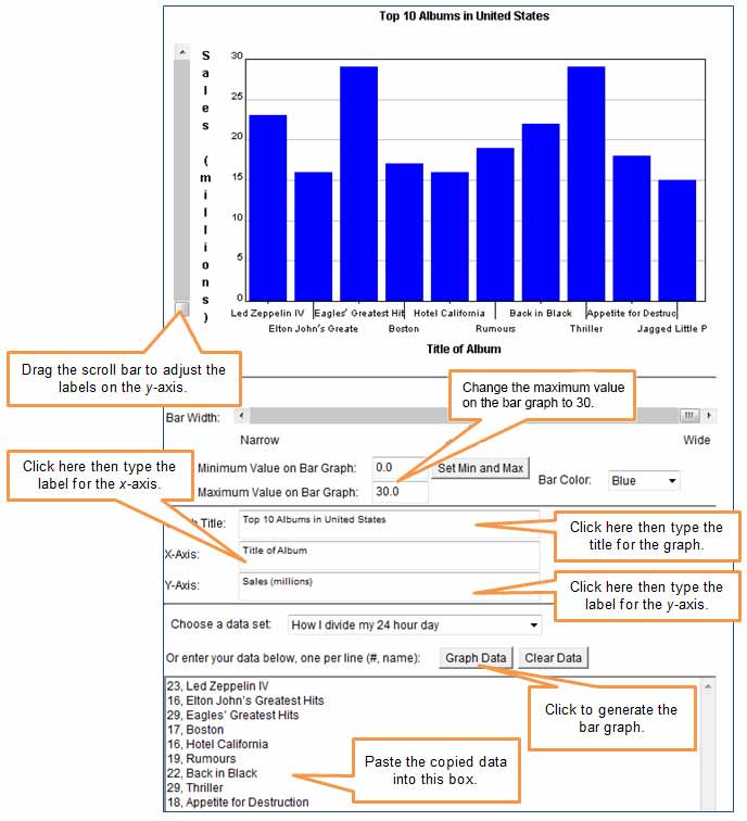
The following table contains only the title of the album and sales from the table above. The sales (in millions) are listed first, and then the title of the album.
Sales, Title |
23, Led Zeppelin IV |
16, Elton John’s Greatest Hits |
29, Eagles’ Greatest Hits |
17, Boston |
16, Hotel California |
19, Rumours |
22, Back in Black |
29, Thriller |
18, Appetite for Destruction |
15, Jagged Little Pill |
Click the image below to open a bar graph generator in a new window. Copy the data from the Sales, Title table above, and paste it into the data box in the bar graph generator. Be sure to give the graph an appropriate title, label each axis, and then click the Graph Data button.
 Interactive popup. Assistance may be required.

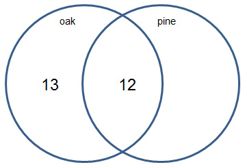
A county extension agent surveyed farmers in her county to determine the number of farmers growing either rice, sesame, or both.
She learned that 35 farmers are growing rice, and 28 farmers are growing sesame. Of these farmers, 21 of them are growing both crops.
Use this information to complete the interactive below.
In the Venn diagram below, drag the appropriate number to its place in the Venn diagram. You may not use all of the number tiles. Remember that in a Venn diagram, each circle represents the total number of farmers planting that crop, and the overlapping region represents the number of farmers planting both crops.
Inside the rice circle, there are two regions. What does each region represent?
Interactive popup. Assistance may be required. What does the overlap of the two circles in a Venn diagram represent?
Interactive popup. Assistance may be required.
The region where the rice circle overlaps the sesame circle represents the farmers who are growing both rice and sesame. The regions outside the overlap represent the farmers who are growing only rice or only sesame.

In the problem, it was stated that 35 farmers are growing rice. Why does the number 35 not appear in the region of the rice circle outside the overlap?
Interactive popup. Assistance may be required. What does the overlap of the two circles in a Venn
Interactive popup. Assistance may be required.
There are 35 farmers growing rice, and that number includes the 21 farmers who are growing both rice and sesame. The difference between these numbers, 35 – 21 = 14, represents the number of farmers growing only rice.
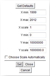
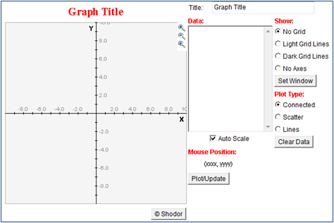
Click the image below to open a line graph generator in a new window.
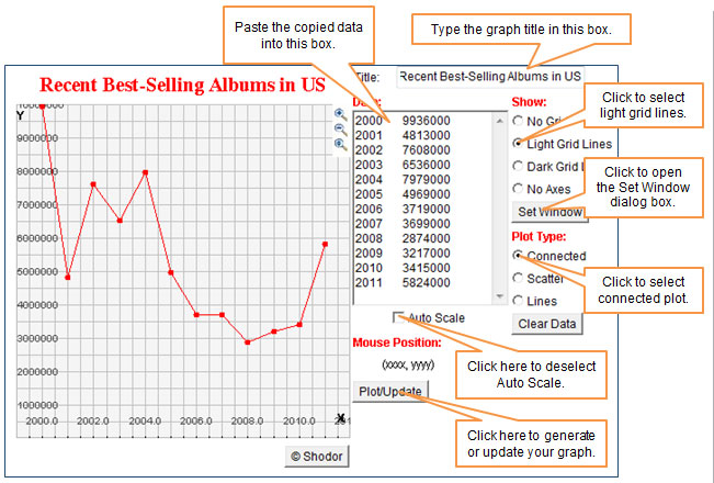
What patterns do you notice in the number of copies of the best-selling albums sold in the United States between 2004 and 2008?
Interactive popup. Assistance may be required. As you read the graph from left to right in this time range, does the line move upward or downward?
The number of copies of the best-selling albums each year during that time range decreased.
Use the line graph to make a general statement about how the number of copies of the best-selling album in the United States from each year since 2000 has changed.
Interactive popup. Assistance may be required. What trends do you notice in the line graph?.
Interactive popup. Assistance may be required.
The following possible answers may include:

How does the way that a bar graph displays categorical data compare to the way that a Venn diagram displays categorical data?
Interactive popup. Assistance may be required. A bar graph shows data in categories that do not overlap, and a Venn diagram shows data in categories that may have overlapping values.
 Interactive popup. Assistance may be required.
29
Interactive popup. Assistance may be required.
29