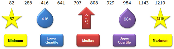
The five-number summary can be used to describe the spread of a data set.
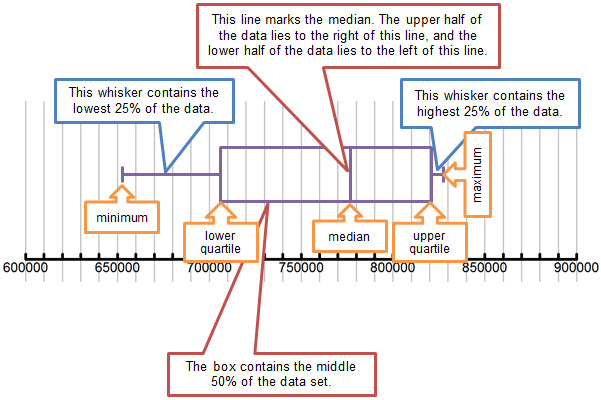
One graphical display, a box-and-whiskers plot, is very useful for visualizing these numbers and showing the spread of data over a number line. In this section, you will learn how to construct and interpret a box-and-whiskers plot.
The table below shows the population of 10 large cities in the United States, according to the U.S. Census Bureau, in 2011.
10 Large Cities in the United States |
||
Rank |
City |
Population |
11 |
Jacksonville, FL |
827,908 |
12 |
Indianapolis, IN |
827,609 |
13 |
Austin, TX |
820,611 |
14 |
San Francisco, CA |
812,826 |
15 |
Columbus, OH |
797,434 |
16 |
Fort Worth, TX |
758,738 |
17 |
Charlotte, NC |
751,087 |
18 |
Detroit, MI |
706,585 |
19 |
El Paso, TX |
665,568 |
20 |
Memphis, TN |
652,050 |
For this data set, calculate the minimum, lower quartile, median, upper quartile, and maximum values.
Interactive popup. Assistance may be required. The numbers are already in order from greatest to least. The median is the average of the middle two numbers, the minimum and maximum are the extreme values, the lower quartile is the median of the lower half of the data, and the upper quartile is the median of the upper half of the data. Interactive popup. Assistance may be required.
Minimum: 652,050
Interactive popup. Assistance may be required.
Minimum: 652,050

Each of the tiles in the interactive represents one of the numbers in the five-number summary for this data set. Drag each tile to its appropriate place on the number line. When all five tiles are placed correctly, "Well Done" will appear.
Next, click the Construct Box button to construct the box portion of the box-and-whiskers plot.
Next, click the Construct Whiskers button to construct the whiskers portion of the box-and-whiskers plot.
A box-and-whiskers plot is useful because it tells you at a glance where each quartile of the data set lies on a number line. A box-and-whiskers plot gives you a sense of the spread of the data.
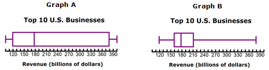
10 Largest Businesses in U.S., 2008 |
|
Business |
Revenue (billions of dollars) |
Wal-Mart |
378.8 |
ExxonMobil |
372.8 |
Chevron |
210.8 |
General Motors |
182.3 |
ConocoPhillips |
178.6 |
General Electric |
176.7 |
Ford Motor |
172.5 |
Citigroup |
159.3 |
Bank of America Corp. |
119.2 |
AT&T |
118.9 |
Source: www.infoplease.com |
|
Which box-and-whiskers plot best matches the data shown in the table?
 Interactive popup. Assistance may be required.
Graph B
Interactive popup. Assistance may be required.
Graph B
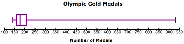
The chart below shows statements related to the graph. Decide if each statement is supported by the information in the graph, and click the appropriate box next to the statement.