To complete this section you will need to closely examine the two maps below (Climate Zones of Earth & Historical Population Density). While studying these maps, consider which climate you think may not attract many people to live and which climates many people would not find attractive for living. Why do you think this is so?
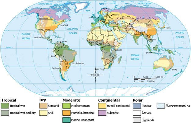
Source: Map, Climate Zones of Earth, Wikimedia.
Helpful information to help you make your comparison:
- The least populated areas on Earth are deserts and extremely cold climate zones.
- Now, look at the Population Density Map, is the first statement true?
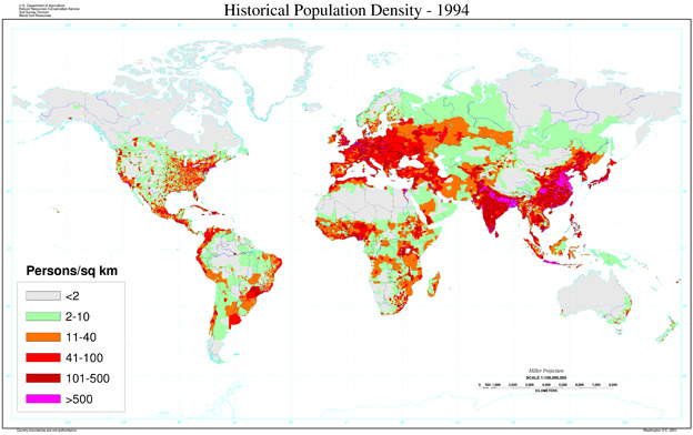
Source: Map, Human Population Density-1994, U.S. Department of Agriculture
Remember
- The pink areas are the most densely populated.
- The dark red, red, and orange areas are also very dense with people.
Helpful Information to help you make your comparison:
- Notice that people are not evenly distributed across the land on Earth.
- The vast majority of Earth's population lives north of the Equator (black line).
- Most people on Earth live between 20 and 60 degrees north of the Equator (in brackets).
- In general, people live closer to plentiful resources.
It's time to put your knowledge to work. Compare the areas of highest population with the climate zones in the activity below.
 Activity Directions:
- Carefully compare the world climate map above to the population density map to choose the correct location on the map below.
- Once you have determined which location on the map matches the description, drag the letter to correct box on the map.