 Source: Population Pyramids of Texas, U.S. Census Bureau.
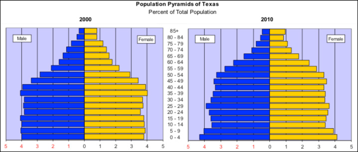
Another way to examine population is by using a population pyramid. A population pyramid is a kind of bar graph. Each horizontal bar shows how many males or females fall into a specific age group. This is called an “age-gender” cohort. The bars are stacked one on top of another in ascending order with the youngest group on the bottom and the oldest on top. A center line divides the graph into a female and male side.
Source: Population Pyramids of Texas, U.S. Census Bureau.
Take a look at the population pyramids of Texas. What is the connection between the age and sex structure of a population? Why does this matter? The age-sex structure determines the potential for growth of specific age groups and the total population. Therefore, an understanding of a population age structure is critical for informed decision-making.
The shape of the pyramid indicates the potential for future growth and can also provide hints about past trends.