 Now let's take a look at some less popular areas to live in the U.S. and the climates that may contribute to the reasons they are so unpopular.
Now let's take a look at some less popular areas to live in the U.S. and the climates that may contribute to the reasons they are so unpopular.
Select the three climates that match with low population density states.
Now let's take another look at Australia.
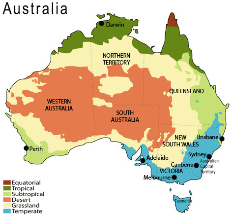
Australia Climate Map, Martyman, Wikimedia
| Australia Population % by State: New South Wales = 34% Victoria = 25% Queensland = 19% Western Australia = 9% South Australia = 7% Tasmania = 3% Australia Capital Territory = 2% Northern Territory = 1% *Note: The majority of the populations in each state are located in the capital cities along the coast. |