Organizing and Describing Data
Statistics & Risk Management
Organizing and Describing Data
Statistics & Risk Management
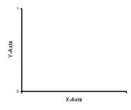
Graphing data is the first and often most important step in data analysis. So now that we have our data set up in frequency tables, we can move forward to illustrating this data in graphs. First, let's understand the graph axis then proceed to the common types of graphs.
Each graph is made up of the Abscissa and the Ordinate:
abscissa - the horizontal axis of a graph (X)
ordinate - the vertical axis of a graph (Y)
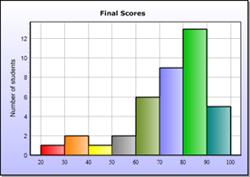
Primary Types of Graphs:
1. Frequency Polygon
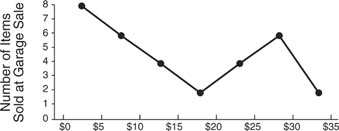
2. Histogram
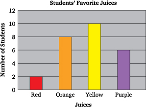
3. Bar Graph
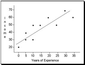
4. Scatterplot

PRACTICE PROBLEM 1.2:
Use the data from practice problem #1 to create:
A. A bar graph
B. A frequency polygon
|
4, 7, 7, 7, 8, 8, 7, 8, 9, 4, 7, 3, 6, 9, 10, 5, 7, 10, 6, 8, 7, 8, 7, 8, 7, 4, 5, 10, 10, 9, 8, 3, 7, 9, 7, 9, 5, 8, 5, 4, 6, 6, 7, 5, 3, 2, 8, 5, 10, 9, 10, 6, 4, 8, 8, 8, 4 |
ANSWER 1.2A (Mouse-Over to Check Your Answer).
ANSWER 1.2B (Mouse-Over to Check Your Answer).
Created with SoftChalk
![]()