Software Proficiency
Statistics & Risk Management
Software Proficiency
Statistics & Risk Management
The correlation between pairs of variables can be calculated in a very similar way.
First, go to the Data Analysis tools. Once you have the menu open, this time you will select correlation:
For Input Range: $K$1:$l$31
This will correlate SAT to Average Score. Notice that in our selection, we again include the column labels. This is important as it will label our correlation matrix appropriately. BUT be sure to put a check in the box 'Labels in first row'.
Again set your Output Range: $O$1.
If you would prefer, you can set the output to go to a new page in the workbook by selecting 'New worksheet Ply'. Note that you would not have to indicate a space for this, as it will automatically be dropped on the first available worksheet in the workbook (or create a new one).
The printout should look like this.
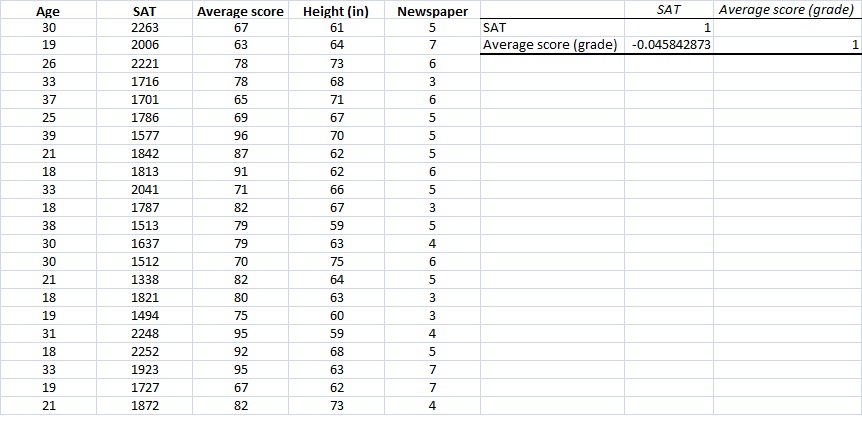
The output is in the form of a correlation matrix. The correlation between Average Score and SAT is -0.046. Obviously not a high correlation (but that wasn't our concern. After all it's not OUR research). Notice the 1's? Anytime we set up a correlation matrix, we will see the the matrix is symmetrical about the diagonal. The diagonal cells always represent the variables being correlated with themselves. Hence the perfect relationship.
If you wanted to, you could use this function to perform multiple correlations by adding more values to the Input Range. Let's do that now with Age, SAT, and Average Score. follow the same procedure and lets see what you get.
You should have selected: $J$1:$K$31 Everything else would remain the same, except that you might want to move your output to a different location, since the previous correlation is still there (unless you already deleted it) I chose: $0$5.
Your printout should look like this.
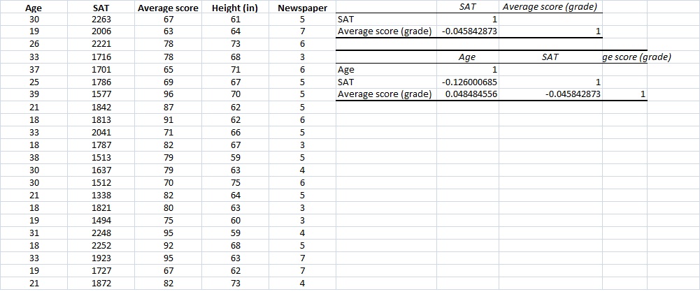
We have actually just very quickly and easily conducted a multicorrelational analysis with minimal work. We can now see three separate correlations. Notice something else. Now not only can you easily see the symmetrical diagonal, but you may notice that nothing is written above this diagonal. The reason is very simple. Since they would be mirror images on the values below the diagonal, there is no point in writing them out again.
One drawback to this analysis is that the output does NOT include the number of pairs of data points used to compute each correlation (which can vary, depending on where you have missing data), and does not indicate whether any of the correlations are statistically significant. This remains one of the strongest critiques of using Excel for correlations.
Created with SoftChalk
mobile page
![]()