Software Proficiency
Statistics & Risk Management
Software Proficiency
Statistics & Risk Management
There are many ways to display our data using Excel. Most simply require you to highlight the appropriate column and select the desired graphing tool. For example, let's create a scatter plot using Age and SAT (just because we have those available in our example).
Simply select J1 through K31. For Excel 2007, go to the insert tab and select Scatter. The first option will be the scatter plot. You should see the following.
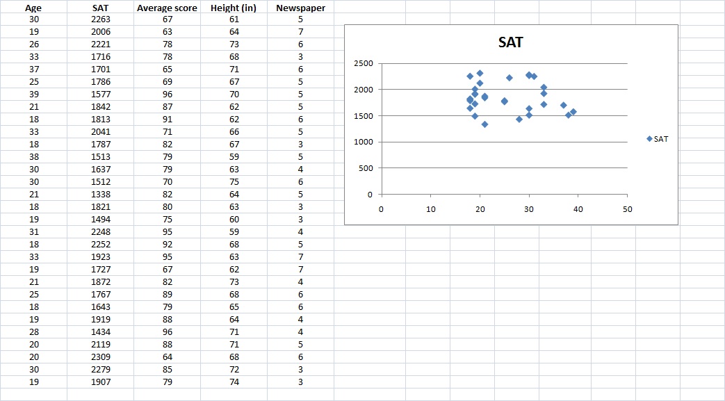
The procedure is the same for creating any number of displays from your data such as pie charts, frequency polygons, etc.
The Histogram
The histogram, on the other hand, is part of the Data Analysis ToolPak and requires a little more explanation.
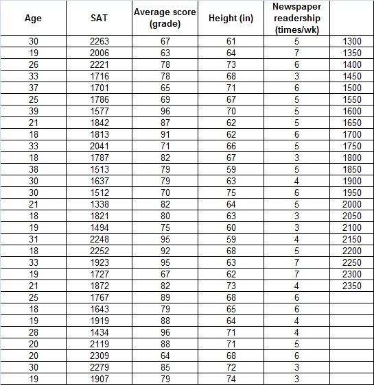
Using the same data set that we used in the last section (no need to try to set up more!), we'll explore how the histogram tool works in Excel. It's important that the input range for a histogram contains quantitative numeric data (such as the test scores); the histogram tool doesn't work with qualitative numeric data (such as the student ID numbers). For our example, we will look at the student's SAT scores.
For this example, save your original practice data set and make a copy of it. Open the copy and delete columns A through I. Making Age start in column A.
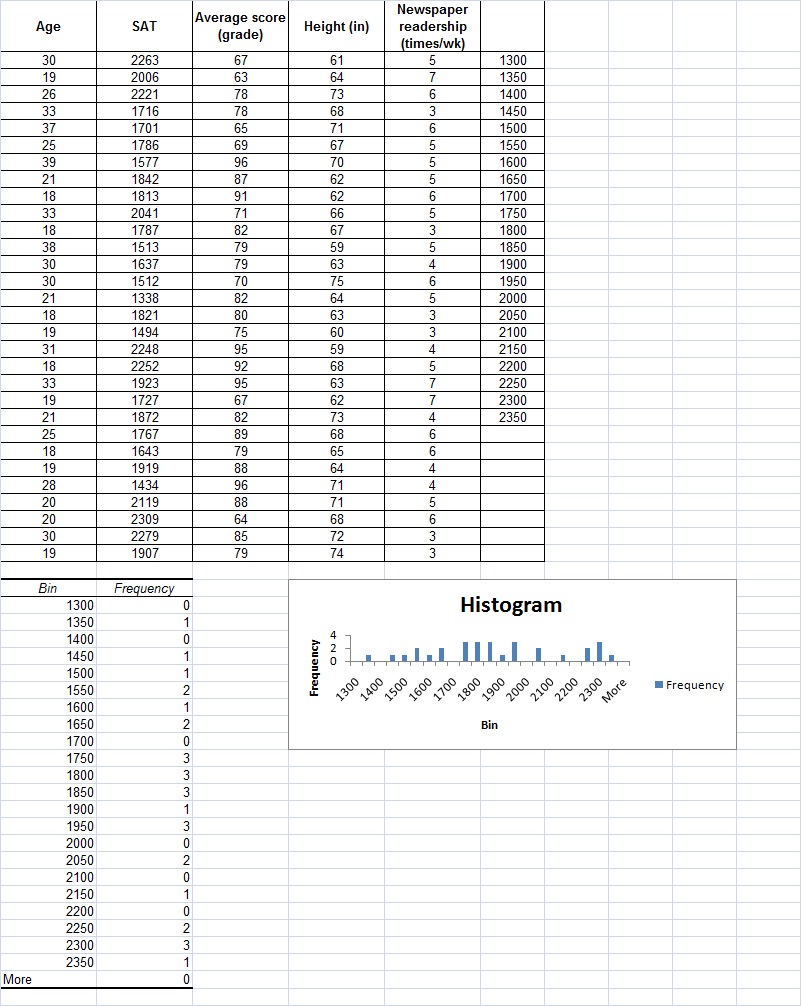
Again, go to the Data Analysis ToolPak. This time, you are going to select histogram. Set up the ranges for the histogram divisions in Input Range (the same as with descriptive statistics). This time, however, we are going to add something new. At the end of your data set (Column F), you will set up a column referred to as the bin range (but do not label the column). This will form the X axis on your histogram. The bin values can be whatever you want them to be, and there can be as many or as few values as you wish, but they must be in ascending order. For our example, we will use 50. We will start with 1300 and go to 2350 as shown here:
Note: If you want, you can leave the Bin Range box blank. The Histogram tool then automatically creates evenly distributed bin intervals using the minimum and maximum values in the input range as beginning and end points. The number of intervals is equal to the square root of the number of input values (rounded down). However, because these bin intervals may have little relation to your data, or the type of analysis you are looking for, it is recommended that you create your own bins.
So, for your input range, select $B$2:$B$31
For your bin range, select $F$2:$F$23
We'll start the output range in cell $A$33. You can also choose to place the output in another worksheet or workbook.
In our example, Chart Output is selected. You can also sort the output or display it in cumulative percentages.
Created with SoftChalk
mobile page
![]()